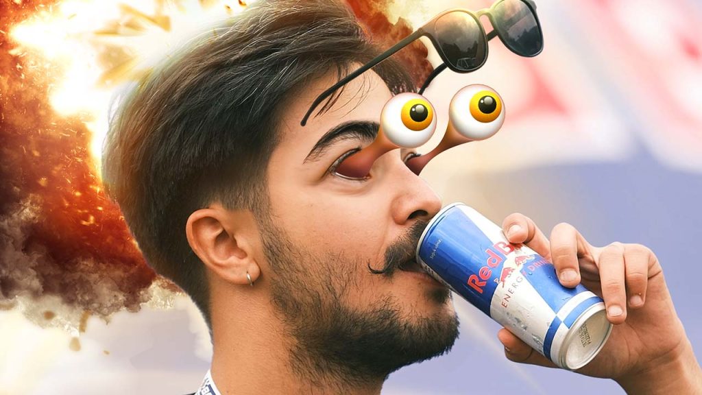
Featured Image Source: Combination of Macrovector, Vika Yatskina & KJ Pargeter
E
nergetic drinks seem to leap off the shelves, packed with colours and fonts so bold you can practically hear them shout.
These cans and bottles reflect the intensity of extreme sports, embodying high energy and an “in-your-face” vibe. But it’s not just loud design for the sake of being loud—it’s a deliberate strategy that targets consumers who crave excitement.
There are valuable lessons to learn here for your business. You don’t need to sell energy drinks or run BMX competitions to capture your audience’s attention the same way. Let’s explore how packaging design—like that of iconic brands such as V Energy—creates cohesive, high-impact branding and what you can apply to your own business.
A Contrast in Branding: Juice vs. Energy Drinks
Juice packaging often feels fresh, green, and grounded, evoking a sense of health, purity, and connection to the farm. This kind of branding takes a more subdued, natural approach, appealing to consumers seeking wellness. In contrast, energetic drinks like V go for maximum impact—bold colours, sharp fonts, and intense energy cues that metaphorically shout from the shelf. It’s all about who you’re talking to.


Visual Targets’ takeaway:
Both approaches are effective in their own context. When developing your business branding, think about your message: Do you want to convey vitality and calm, or is your brand about excitement and action?
The juice brand whispers promises of wellness, while the energy drink yells adrenaline.
Point of Sale: Cohesion from Packaging to Billboards
What makes energy drink brands like V stand out isn’t just their packaging—it’s how they extend that energy across all their point-of-sale materials on display in stores, at events – anywhere the brand is promoted. From cardboard stands and gondola ends to posters and billboards, every element reflects the same loud, high-energy vibe. This consistency is key to building a strong brand identity.

Visual Targets’ takeaway:
When creating your own brand materials, take a page from their book: Ensure your packaging, point-of-sale displays, signage, and advertising feel connected and consistent. Whether it’s a flyer, product label, or end-of-aisle display, all elements should align with your brand identity, leaving no room for confusion.
Athlete Ambassadors: Tying the Brand to Identity

Energetic drink brands like V, Monster and Red Bull don’t stop at visual design—they actively build relationships with athlete ambassadors and extreme sports events. This connection reinforces their brand identity by associating their products with high-energy lifestyles.
Visual Targets’ takeaway:
For your business, partnerships with influencers or ambassadors that reflect your values can help amplify your message. Whether you run a fitness studio or a food brand, find partnerships that align with your brand’s core identity. A well-chosen ambassador can help bring your brand to life for your audience, building trust and excitement.
Loud Packaging Meets Smart Advertising
The effectiveness of energetic drinks comes from more than flashy packaging—they back it up with clever advertising that creates desire. You’ll see these products everywhere: plastered on billboards, front and centre in end-of-aisle displays, or boldly displayed on cardboard stands. Each touchpoint tells the same story, reinforcing the idea that this drink isn’t just a beverage—it’s an energy boost, an adventure in a can.

Tip On-Target: Touchpoints are becoming more important in a social media saturated world:
- It currently takes approximately 6 / a half-dozen touchpoints with a customer before they are ready to buy a product.
- This number will likely rise as customers have their attention pulled in various directions by new mediums, and technologies, in the future.
Visual Targets’ takeaway:
Your business can follow a similar approach by ensuring that every interaction with your brand reflects the same cohesive message. Whether it’s through posters, social media ads, or packaging designs, a consistent tone reinforces your brand identity and makes your offerings more memorable.
The Takeaway: Channeling Energy into Your Own Branding
The world of energetic drinks teaches us that bold branding is a strategy, not just an aesthetic. It’s about tapping into emotions and crafting a message that resonates deeply with your audience. Whether you want your brand to feel calm and grounded, like a fresh juice, or electrifying and intense, like an energy drink, the key is consistency across every touchpoint.
When done right, it leaves a lasting impression.
Design isn’t just about looking good—it’s about creating a brand identity that speaks clearly and consistently.
Let Us Help You Energize Your Brand
Energetic drink packaging shows us the power of bold, consistent branding, and the same principles apply across industries. Whether you need help designing packaging, signage, or advertising materials, Visual Targets can bring your brand identity to life.
Get in touch with us, and let’s create something vibrant, engaging, and uniquely yours!

Creative genius, talented wordsmith and all-rounder copywriter up for the grabs! If you can’t stand the look of your copy right now, she’ll shape your rambles into the most compelling words.
Marie Rene | LinkedIn


